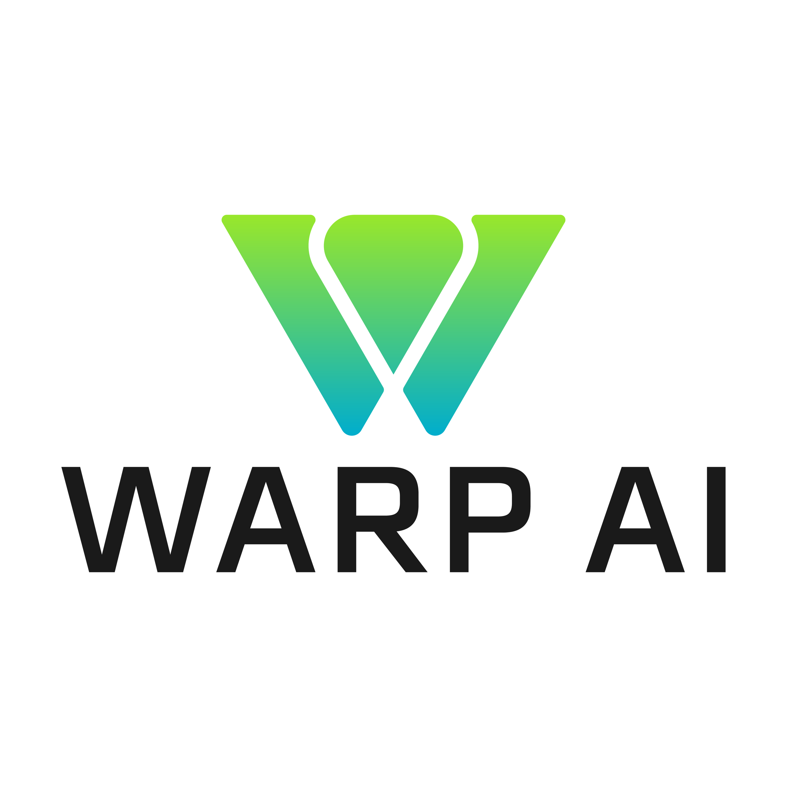
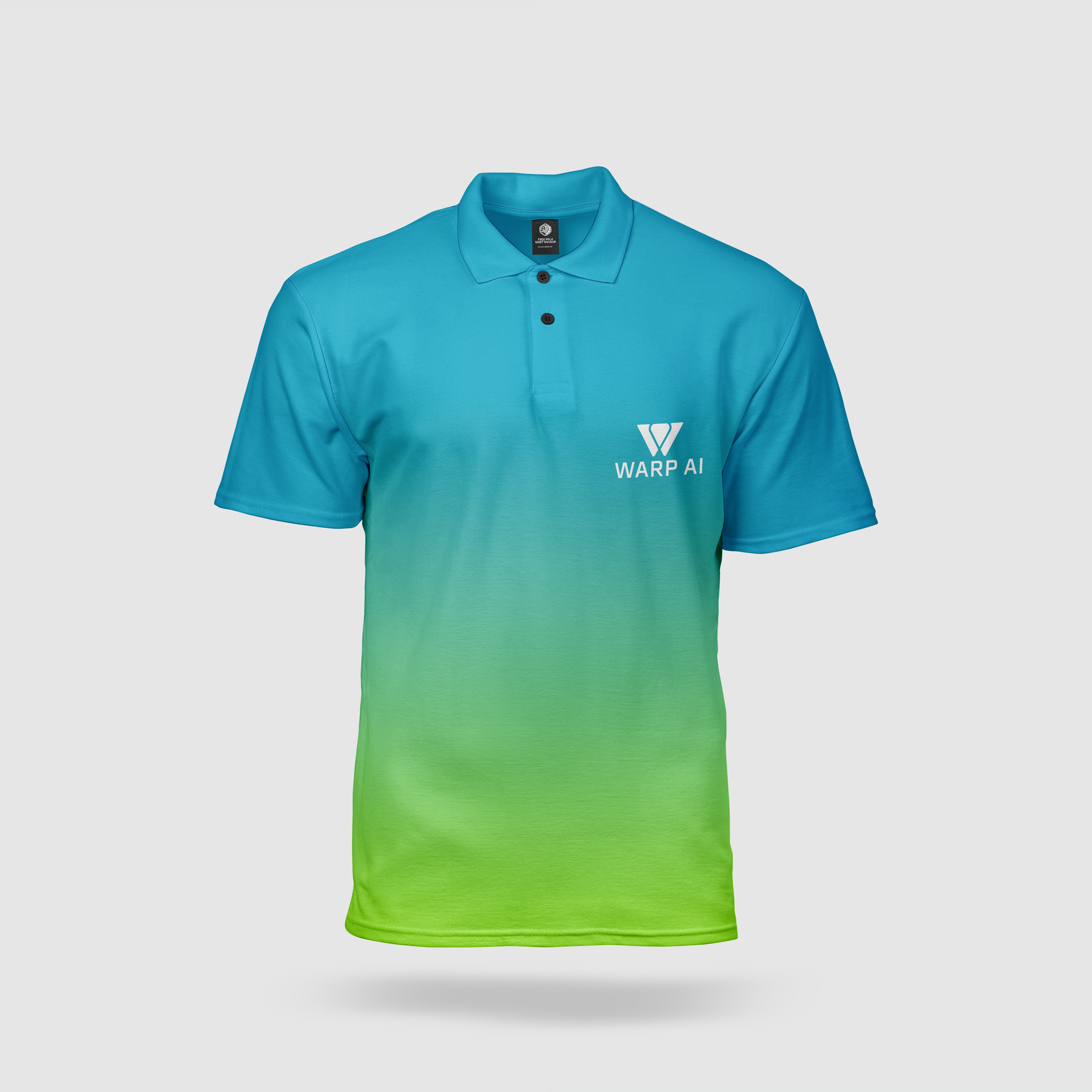
Warp AI
I wanted to do come with an AI company to do branding for but one thing I wanted to stay away from was the usual circular twisting style logo they all seem to have and try to come up with something that would stand out from that. I still wanted it to look like it would work for a tech company and I think the unique “W” along with the green and blue blending together achieves that.